3 Unwritten Rules for More Attractive Santa Barbara Business Signs
There are many excellent Santa Barbara business signs, and most of them follow some unwritten rules that only those in the sign industry may be aware of. It’s a good idea to understand these rules if you plan to design your own signage or you want to hire the best sign services, so let’s examine them.
1. Less Can Be More
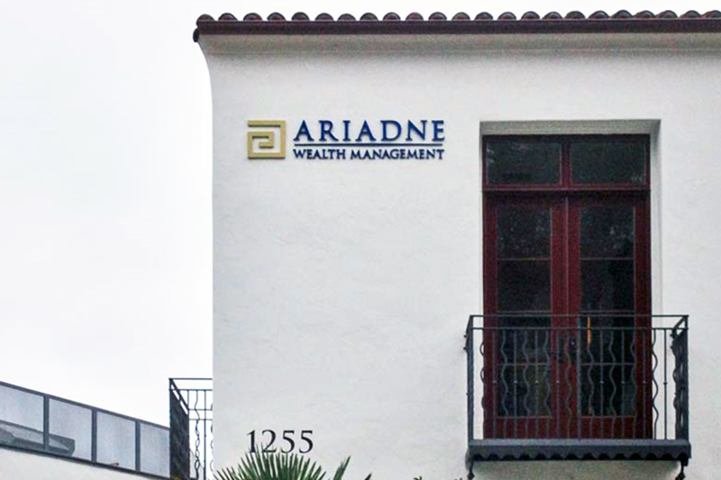
You can make your Santa Barbara business signs too colorful, complicated, or complex. This is especially true when it comes to exterior signage that is viewed from a short distance away. In fact, some businesses (like financial services) are expected to project a conservative image and one that establishes a sense of trust. This is best done with tastefully designed and constructed signs like the one you see at Ariande Wealth Management. When you look for a reputable financial planner, this is the kind of image most people expect to find.
2. Size Matters…But
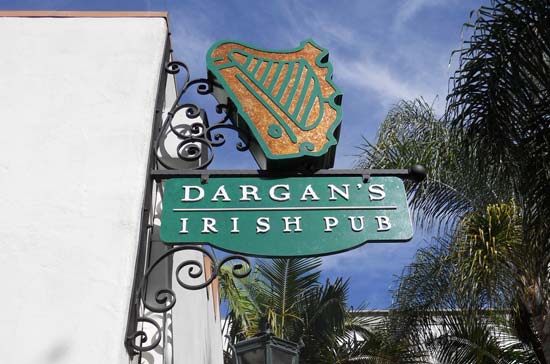
It’s important for Santa Barbara business signs to be large enough to attract attention and for the customer to read the content. However, there is much more than size when it comes to attraction. Take the impressive illuminated blade sign for Dargan’s Irish Pub. This is the kind of signage that pub patrons expect from one of the local favourites. It’s totally unique and reflects the many years of experience that only seasoned sign professionals can deliver.
3. Make No Mistake
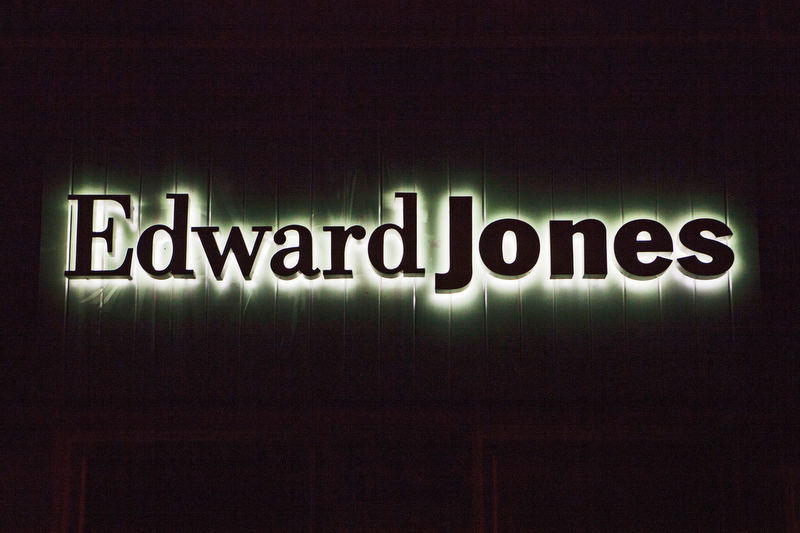
When you check out the Edward Jones Sign in the nighttime or daytime, there is no mistake what business you are looking at (a trusted financial advisor’s business sign). It simple, direct, and to the point, and at the same time, attracts enough attention to get noticed. To discover the many good things that Dave’ Signs has to offer, call us today at (805) 641-1387. Let’s go over your signage needs.
