5 Sign Design Tips
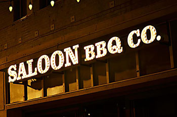
Signs are some of the first things that any customer notices. This makes it necessary to focus on sign design in order to make a great impression on your customers. A well-designed business sign, with a simple yet clear design and the right color combination, will definitely attract the attention of passers-by. Check out this sign below.

Aspects To Keep In View
We at Dave’s Signs pride ourselves on the quality of our signs. Here are 5 design tips from our experts:

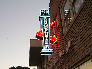
Check out the great colors in this sign above.
- Readability Matters – It’s important to use fonts that are readable. Using cursive letters or highly stylistic fonts can only make the sign very difficult to read.
- The Right Color Combination – It’s important to use the right color combination in order to make a positive impact on your customers. While most companies use their corporate or business colors in their signs’ and logo, it important to use the right background color for your sign.
- The Right Size – The dimension is the other aspect to keep in view while designing any outdoor signage. The sign itself and the message on it need to be very clearly visible and readable from the standard viewing distance. Ensure that the sign stands out from its immediate surroundings.
- Ensure It’s Legible – Just as you focus on using the right font, it’s also necessary that you maintain sufficient spacing between the letters or words. This will help customers distinguish between them easily.
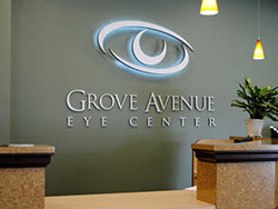
- Get Creative – It’s a good idea to get creative with your outdoor signs. You can do this by changing the shape, size, color, and This is a great way to continue holding the attention of your customers. Check out this sign below.

Dave’s Signs designs, manufactures, installs, and services all sign types. For more information, feel free to call us at (805) 641-1387, or reach out to us online and we will get back to you shortly.


