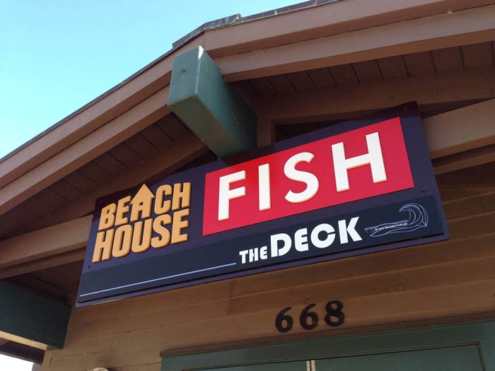
Beach House Fish Dimensional Letter Signs
The Ventura Pier attracts tourists and locals alike, gravitating toward the beautiful ocean-scape that makes this quaint little beach town what it is.This makes the restaurant on the pier one of Ventura’s most prime locations.
For years there was an upscale restaurant on the pier with an upstairs deck looking over panoramic views of the water. However, within the last year the owners decided to re-present the restaurant as casual and accessible.It was renamed “Beach House Fish,” and because we had a long-standing relationship with them, they chose us to help rebrand the restaurant through signage.
The goal was simple: direct visitors to the pier, and from there to the restaurant, upstairs to the bar deck, or to the taco stand. There’s something available for every hungry or thirsty customer.
To make this goal a reality, we had to make sure that these signs were visible from a distance. Every hungry person on the beach should be able to see the restaurant signs. The clients came to us with basic ideas as to how to make this happened, then we suggested placement and an altered logo to ensure that the signs were definitely readable.
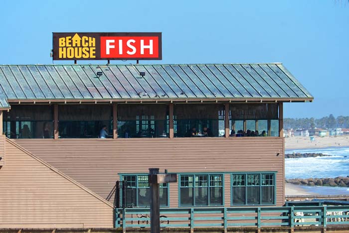
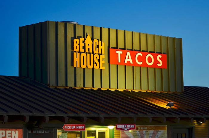
We went with non-illuminated, dimensional signs. First we built the Beach House Taco Sign, then the deck and Beach House Fish signs. We decided on a simple design with high-contrast colors. The high contrast colors make the words highly visible against their backdrop. At night the unlit signs are lit with spotlights, making the high contrast effect visible even at night.
The letters of the signs are unique in that they are made of ½” stud mounted acrylic letters, painted with high-quality automotive paint. Being so close to the ocean, the sign is in a harsh environment. This paint will last a long time despite the conditions.
The deck sign was slightly more complicated, because we had to make sure that people saw an additional sign despite the fact that they already “know” what the sign is. For this task we went with backlit white letters and an arrow with LED lights pointing to “The Deck.” Customers can’t help but notice it.
The great news for the business is that is that since choosing to go with a more casual vibe and rebranding, business has taken off to who new levels.
