Signage Design – 4 Common Mistakes to Avoid
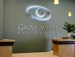
Signs for business are some of the best advertising tools you can use because they stay on the job night and day. However, improper signage design can do much harm to your business, and the sad thing is, you might not even know it. Here are four of the most common mistakes business owners make with their signs today.
1. Too Much Information
Some people try to get as many words or ideas into their signs as possible. After all, you might have many things to say and a lot of good things you are proud of. However, when signs are simple, direct, and to the point, they do their job in the most efficient way. Business signs should get people to notice your business. Their most important job is to attract attention, not tell an entire story.

2. Poor Location
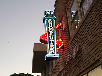
Have you ever struggled to read a sign because you weren’t in the right place? Maybe you can’t read some signs because they’re too small? This happens when signage design doesn’t take size and positioning into consideration. It’s often a result of inexperience or lack of training.
3. Day or Night Only Signs
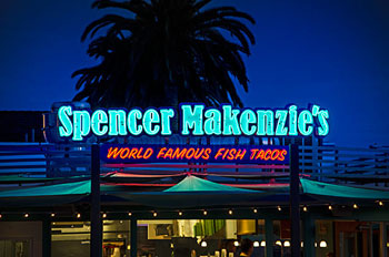
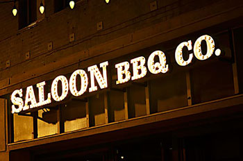
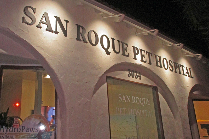
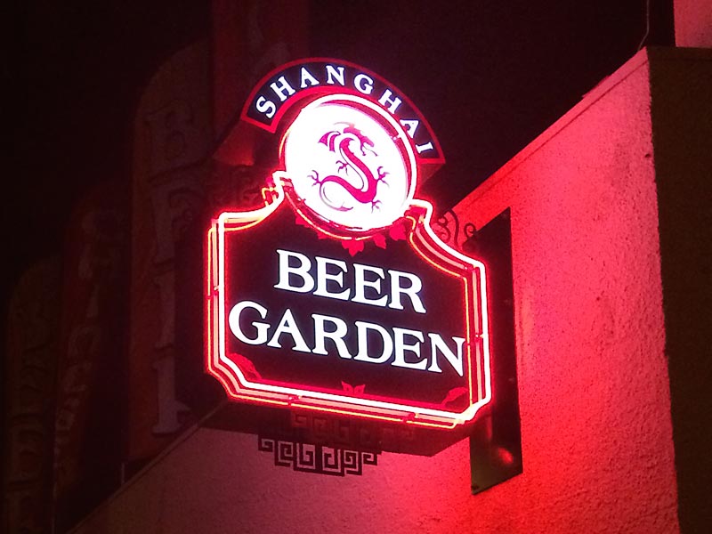
Some signs are beautiful at night, and you can barely notice them in the daytime, or vice-versa. Your signs need to look their best 24 hours a day, and a professional designer creates signs which are perfectly lit at night and still have excellent daytime visibility.
4. Not Knowing How to Cut Costs
When you cut signage design costs to the bone, you end up with cheap signs. However, there are ways you can keep costs down without sacrificing quality. If you have a limited budget, it’s important to choose a sign company like Dave’s Signs. We work with you while keeping your budget in mind. Call us today at (805) 641-1387 for more details.
